
Inliner temperature curve (simulation)
Shows the temperature curve in the inliner in the currently selected flow path
In the Inliner temperature curve (simulation) diagram, the temperature curve in an inliner is highlighted in comparison to the Temperature curve (simulation) diagram.
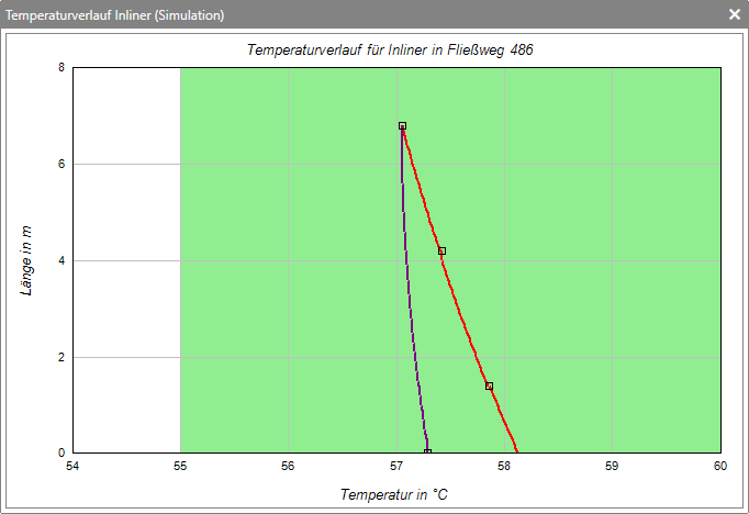
The red line represents the temperature drop in the cladding tube, while the purple line represents the temperature curve in the inliner itself. The green area of the diagram represents the permissible temperature range.
The red line represents the temperature drop in the cladding tube, while the purple line represents the temperature curve in the inliner itself. The green area of the diagram represents the permissible temperature range.